The printed Maphover map uses the Gall stereographic map projection, which is a slightly modified version of the traditional Mercator map.
The Mercartor map projection is the most common map projection in the World. Even Google uses it. Its success came from revolutionising navigation. It was the first map that made ship navigation easy. This popularity helped the map spread from nautical decks and into atlas’ and classrooms world wide.
Some map purists state that the mercartor map projection is inaccurate. So the question is – If it’s so bad, why do we keep using it? Let’s take a look at the history of the Mercator projection along with its advantages and disadvantages.
Spheres and rectangles don’t fit
Our earth is spherical (not a perfect sphere though). Therefore all the continents are arranged on a spherical shape.
However most of our maps are printed on rectangular paper. And spherical objects don’t perfectly translate to rectangular shapes.
We can’t 100% transpose a spherical map into a rectangular map without sacrificing some detail. So, in order to make a rectangular map, we need to make changes that preference some aspects of the spherical map over others. And it’s these preferences that are debated and critisised by map cartographers around the world.
Here’s an animation showing how the world’s sphere is divided and modified to fit within a rectangular Mercator map projection:
A history of the Mercartor Map Projection
Sailing a merchant ship was tough in the 1500’s. Forget GPS. Instead, navigation required sailors to constantly calibrate their ship’s angle to their destination. This was achieved by calculating mathematical revisions as the ship sailed onward. The Mercator map changed this constant need for recalibration, by making all the angles constant. And it was this key factor that catapulted the Mercartor map to the prominence it has today.
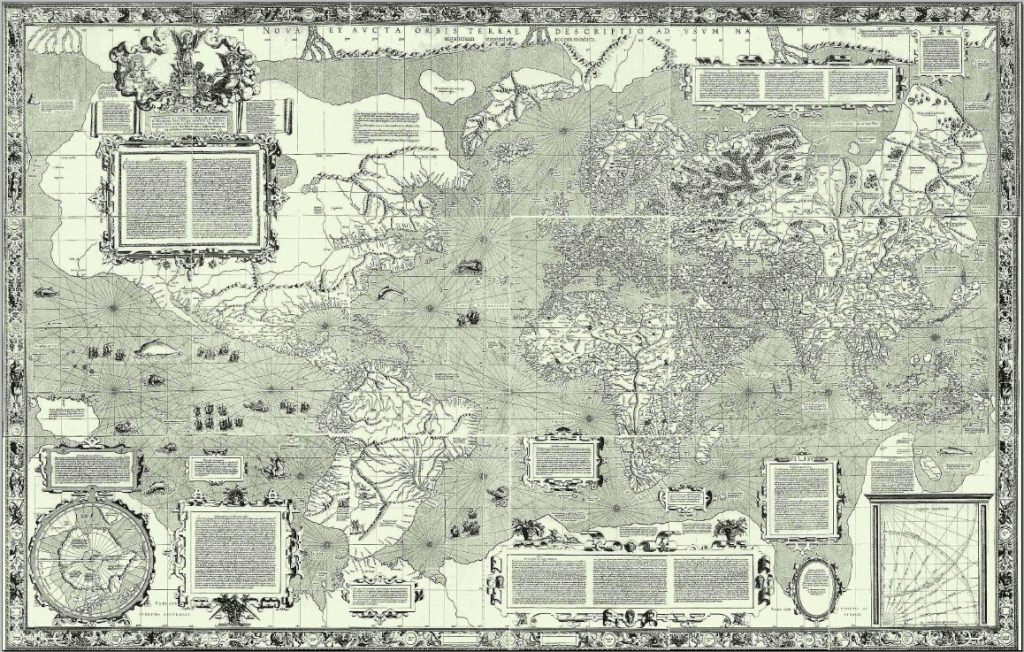
The Mercator map projection was invented by Gerardus Mercator (1512-1594). Born in what is now the German region, Mercator was a keen cartographer and even coined the term ‘atlas’ to describe a collection of maps. In 1569 he created the Mercartor map projection. Below is what it looked like:
Mercator drafted his map so that the lines of latitude (north south lines) and longitude (west east lines) stayed constant. That meant that the geometric angles between countries were preserved so sailors could set their course by one simple compass reading. So once accurate compass use was adopted in the middle of the 18th century, the use of the Mercartor map was embraced.
Advantages of the Mercator projection
Navigation: The biggest advantage is ease of navigation. The Mercator map projection uses a basis of rectangular latitude and longitude lines. These lines preserves the true geometric angles between each country. So, if a ship’s pilot wishes to travel from South Africa to Brazil, they would simply calculate the angle of passage – then steer the ship using that bearing. No more calculations and no more recalculation worries.
Familiarity: The Mercator map projection has created the world map benchmark. People are familiar with using the Mercator map to make sense of the world. Presenting other map projections can draw confusion or suspicion.
Country visibility: Europe has dozens of countries spread over a small region. The Mercator projection shows Europe at a comparatively larger size. This makes it easier to label European countries in a legible manner.
Disadvantages of the Mercator projection
Size distortion: The biggest disadvantage is that the Mercator projection skews the size of countries that are closest to the north and south poles. This distortion was necessary to preserve the constant navigation angles required for shipping navigation.
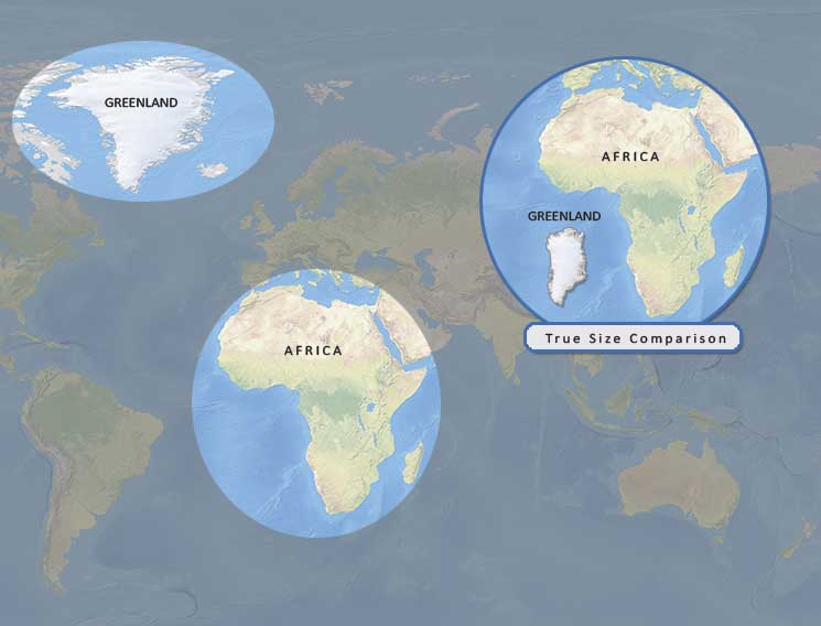
This distortion is most evident when comparing Greenland to Africa:
Using the Mercartor projection (above), Greenland appears to be relatively close in size to the whole of Africa. But this is due to distortion. In reality, Africa is 14 times larger than Greenland (30.2 million Km2 vs 2.16 million Km2). Mercartor’s visual size discrepancy is due to Greenland being at the top of the map and Africa being in the middle of the map. The Mercartor projection stretches countries that are located towards the north and south poles. It does this to preserve navigational angles.
The Gall-Peters projection is an alternative rectangular projection to Mercartor. Created in 1855 by James Gall, the projection shows a more accurate size comparison between countries. However the angles and distances between countries are inaccurate (the opposite problem for Mercartor).
Other map projections generally favoured by cartographers are circular in shape. And although these are more accurate, the practicalities of adding country names becomes extremely difficult. Plus when sized to a rectangular map, the overall detail becomes too small.
Below are some examples of the alternate map projections Mollweide and Winkel-Tripel.


